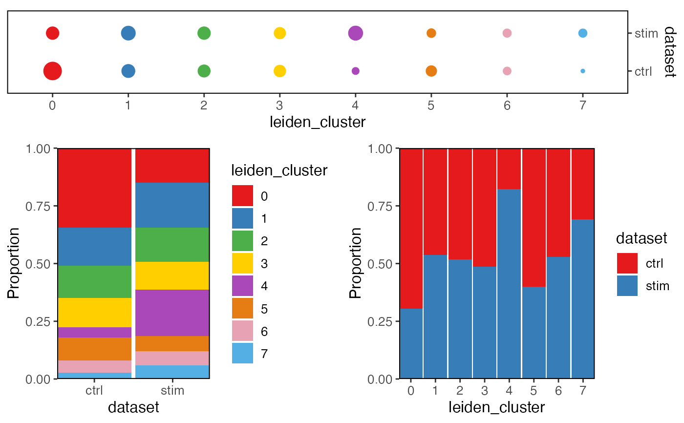
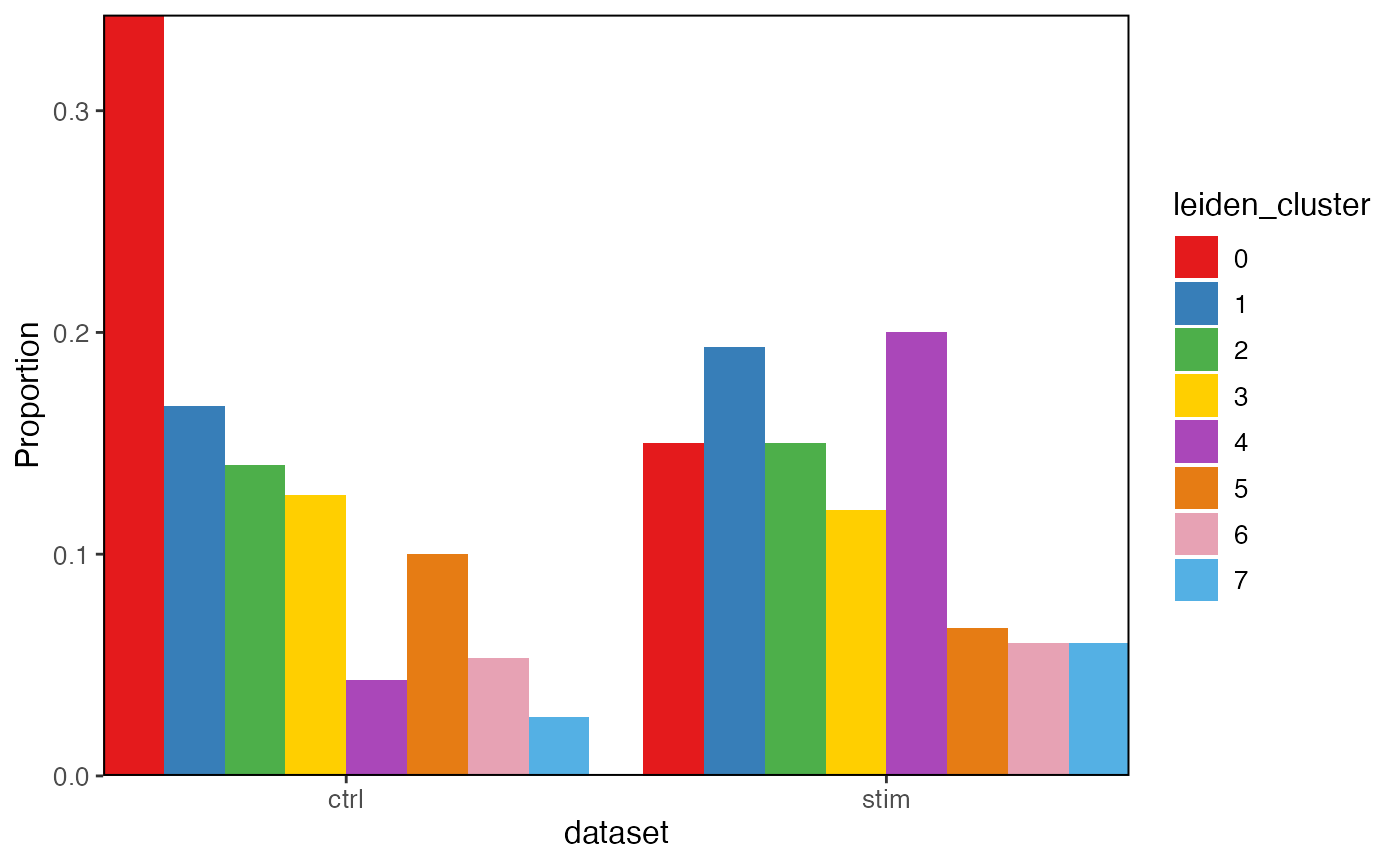
plotProportionBar creates bar plots comparing the
cross-category proportion. plotProportionDot creates dot plots.
plotClusterProportions has variable pre-specified and calls the dot
plot. plotProportion produces a combination of both bar plots and dot
plot.
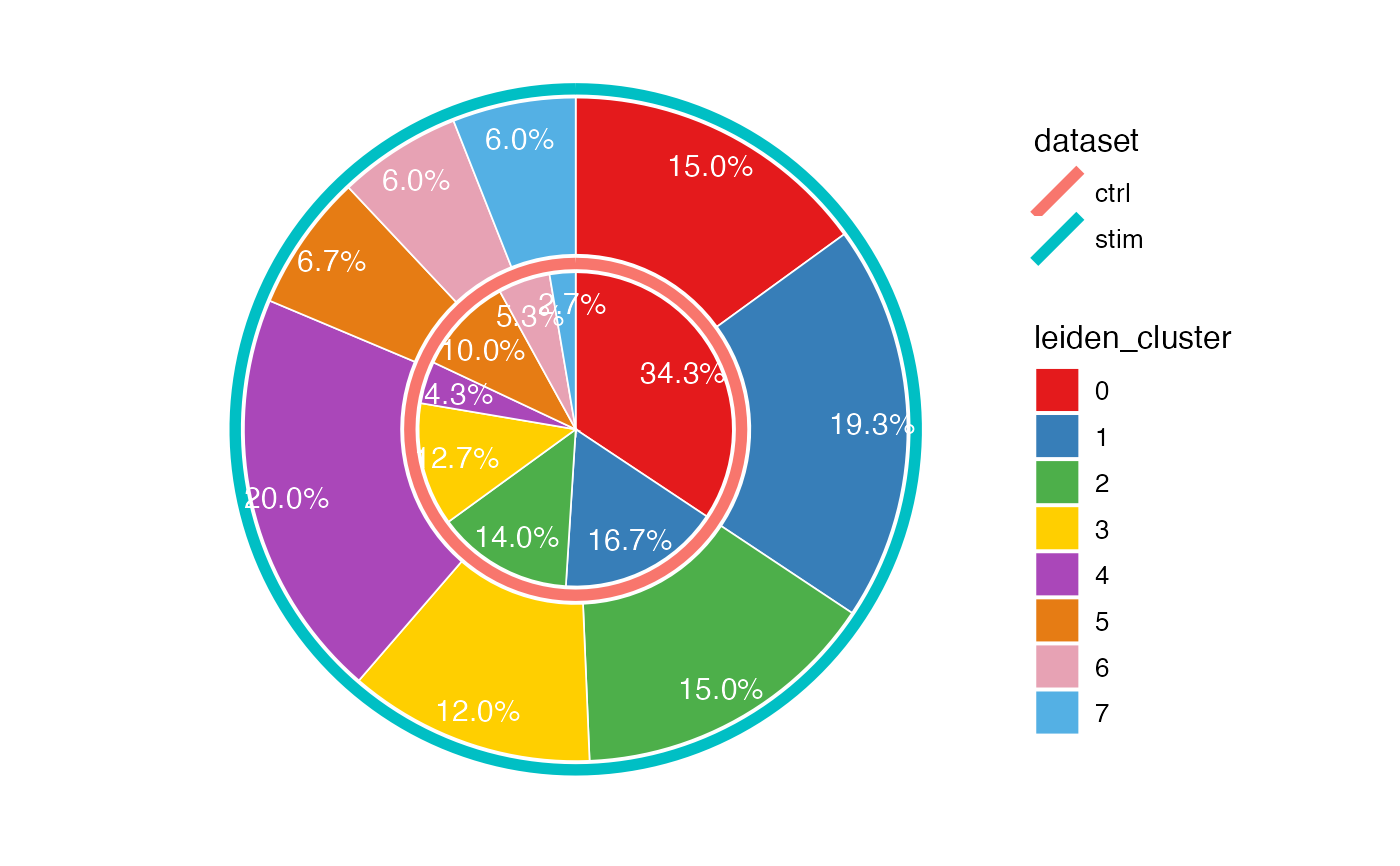
Having package "ggrepel" installed can help adding tidier percentage
annotation on the pie chart. Run options(ggrepel.max.overlaps = n)
before plotting to set allowed label overlaps.
Usage
plotProportion(
  object,
  class1 = NULL,
  class2 = "dataset",
  method = c("stack", "group", "pie"),
  ...
)

plotProportionDot(
  object,
  class1 = NULL,
  class2 = "dataset",
  showLegend = FALSE,
  panelBorder = TRUE,
  ...
)

plotProportionBar(
  object,
  class1 = NULL,
  class2 = "dataset",
  method = c("stack", "group"),
  inclRev = FALSE,
  panelBorder = TRUE,
  combinePlot = TRUE,
  ...
)

plotClusterProportions(object, useCluster = NULL, return.plot = FALSE, ...)

plotProportionPie(
  object,
  class1 = NULL,
  class2 = "dataset",
  labelSize = 4,
  labelColor = "black",
  circleColors = NULL,
  ...
)
Arguments
- object
A liger object.
- class1, class2
Each should be a single name of a categorical variable available in
cellMetaslot. Number of cells in each categories inclass2will be served as the denominator when calculating proportions. By defaultclass1 = NULLand uses default clusters andclass2 = "dataset".- method
For bar plot, choose whether to draw
"stack"or"group"bar plot. Default"stack".- ...
Arguments passed on to
.ggplotLigerThemetitle,subtitle,xlab,ylabMain title, subtitle or X/Y axis title text. By default, no main title or subtitle will be set, and X/Y axis title will be the names of variables used for plotting. Use
NULLto hide elements.TRUEforxlaborylabshows default values.legendFillTitleLegend title text for fill aesthetics, often used for violin, box, bar plots. Default
NULLshows the original variable name.legendPositionText indicating where to place the legend. Choose from
"top","bottom","left"or"right". Default"right".baseSizeOne-parameter control of all text sizes. Individual text element sizes can be controlled by other size arguments. "Title" sizes are 2 points larger than "text" sizes when being controlled by this.
titleSize,xTitleSize,yTitleSize,legendTitleSizeSize of main title, axis titles and legend title. Default
NULLcontrols bybaseSize + 2.subtitleSize,xTextSize,yTextSize,legendTextSizeSize of subtitle text, axis texts and legend text. Default
NULLcontrols bybaseSize.colorLabelsCharacter vector for modifying category names in a color legend. Passed to
ggplot2::scale_color_manual(labels). DefaultNULLuses original levels of the factor.colorValuesCharacter vector of colors for modifying category colors in a color legend. Passed to
ggplot2::scale_color_manual(values). DefaultNULLuses internal selected palette when <= 26 categories are presented, otherwise ggplot hues.legendNRow,legendNColInteger, when too many categories in one variable, arranges number of rows or columns. Default
NULL, automatically split toceiling(levels(variable)/10)columns.colorPaletteFor continuous coloring, an index or a palette name to select from available options from ggplot
scale_brewerorviridis. Default"magma".colorDirectionChoose
1or-1. Applied whencolorPaletteis from Viridis options. Default-1use darker color for higher value, while1reverses this direction.colorLow,colorMid,colorHigh,colorMidPointAll four of these must be specified to customize palette with
naColorThe color code for
NAvalues. Default"#DEDEDE".scale_colour_gradient2. DefaultNULL.plotlyWhether to use plotly to enable web based interactive browsing for the plot. Requires installation of package "plotly". Default
FALSE.
- showLegend
Whether to show the legend. Default
TRUE.- panelBorder
Whether to show rectangle border of the panel instead of using ggplot classic bottom and left axis lines. Default
FALSE.- inclRev
Logical, for barplot, whether to reverse the specification for
class1andclass2and produce two plots. DefaultFALSE.- combinePlot
Logical, whether to combine the two plots with
plot_gridwhen two plots are created. DefaultTRUE.- useCluster
For
plotClusterProportions. Same asclass1whileclass2is hardcoded with"dataset".- return.plot
![[Defunct]](figures/lifecycle-defunct.svg)
- labelSize, labelColor
Settings on pie chart percentage label. Default
4and"white".- circleColors
Character vector of colors.
plotProportionPieparameter for setting the colors of circles, i.e. categorical variable controlled byclass2. DefaultNULLuses ggplot default hues.